LOGOS
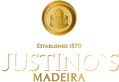
The new brand identity of Justino’s Madeira Wines has maintained its symbol, consisting of a castle and two fur seals, which are associated with Câmara de Lobos, where the company used to have warehouses for ageing its wines in its early days. In turn, the castle is an allusion to the place where some of these warehouses were located – “sítio da Torre”. The circular shapes around these elements give balance and dynamics to the brand image and, at the same time, reinforce the global nature of the company.
With the same simple yet sophisticated lettering, reinforced with a gold outline, Justino’s Madeira Wines is now using the company’s colours, with gold predominating, confirming the elegance, harmony and premium positioning the brand has had for several decades.
This new identity also reinforces the position of the company and its products, along with consolidating Justino’s Madeira Wines as an important producer of Madeira wines, at home and abroad. The new logo also portrays the main values that the brand has defended since its foundation in 1870, such as tradition and quality.